Toggle navigation
Project name
WORK
Ricreazione
Fondazione Achille Castiglioni
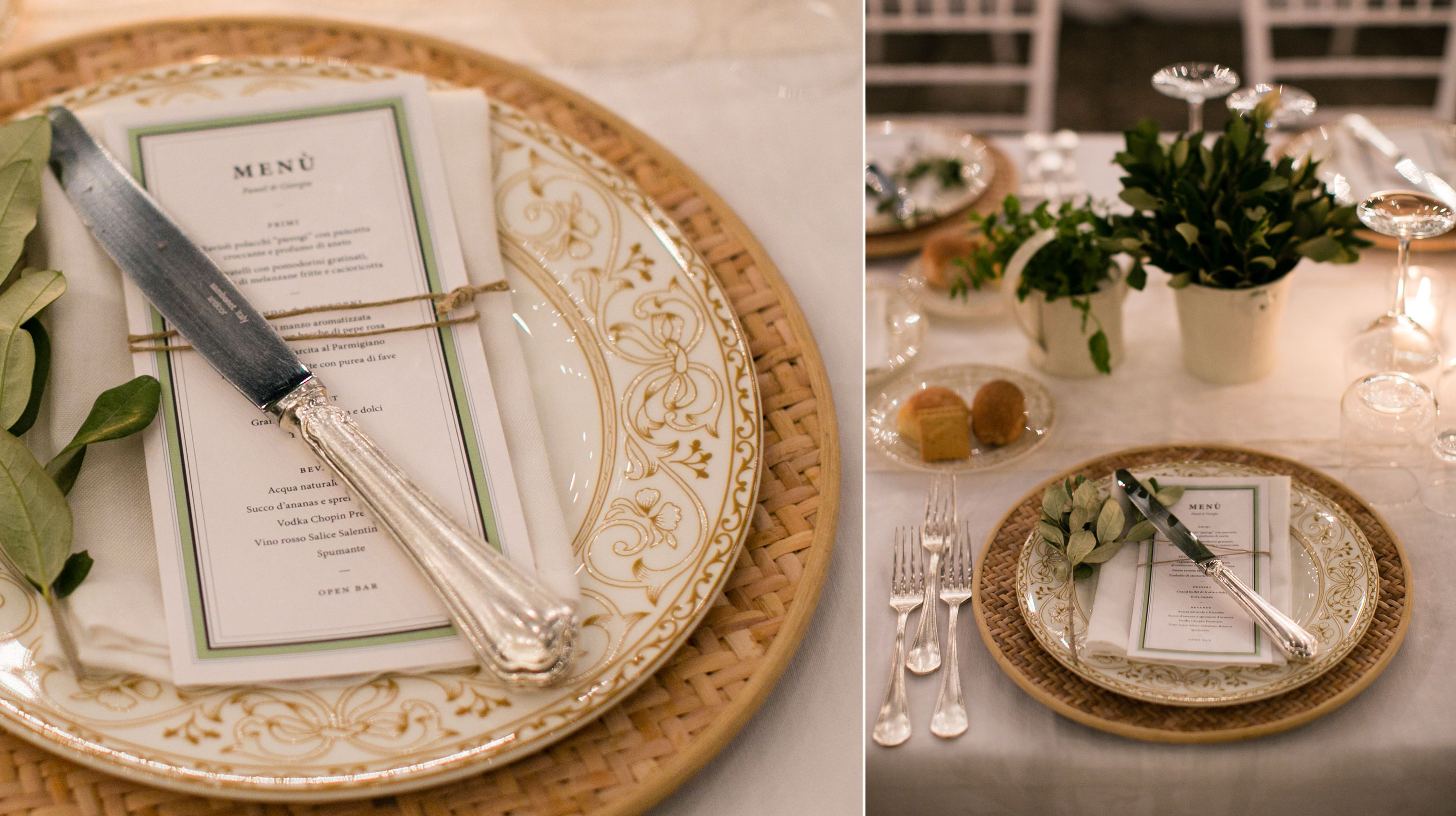
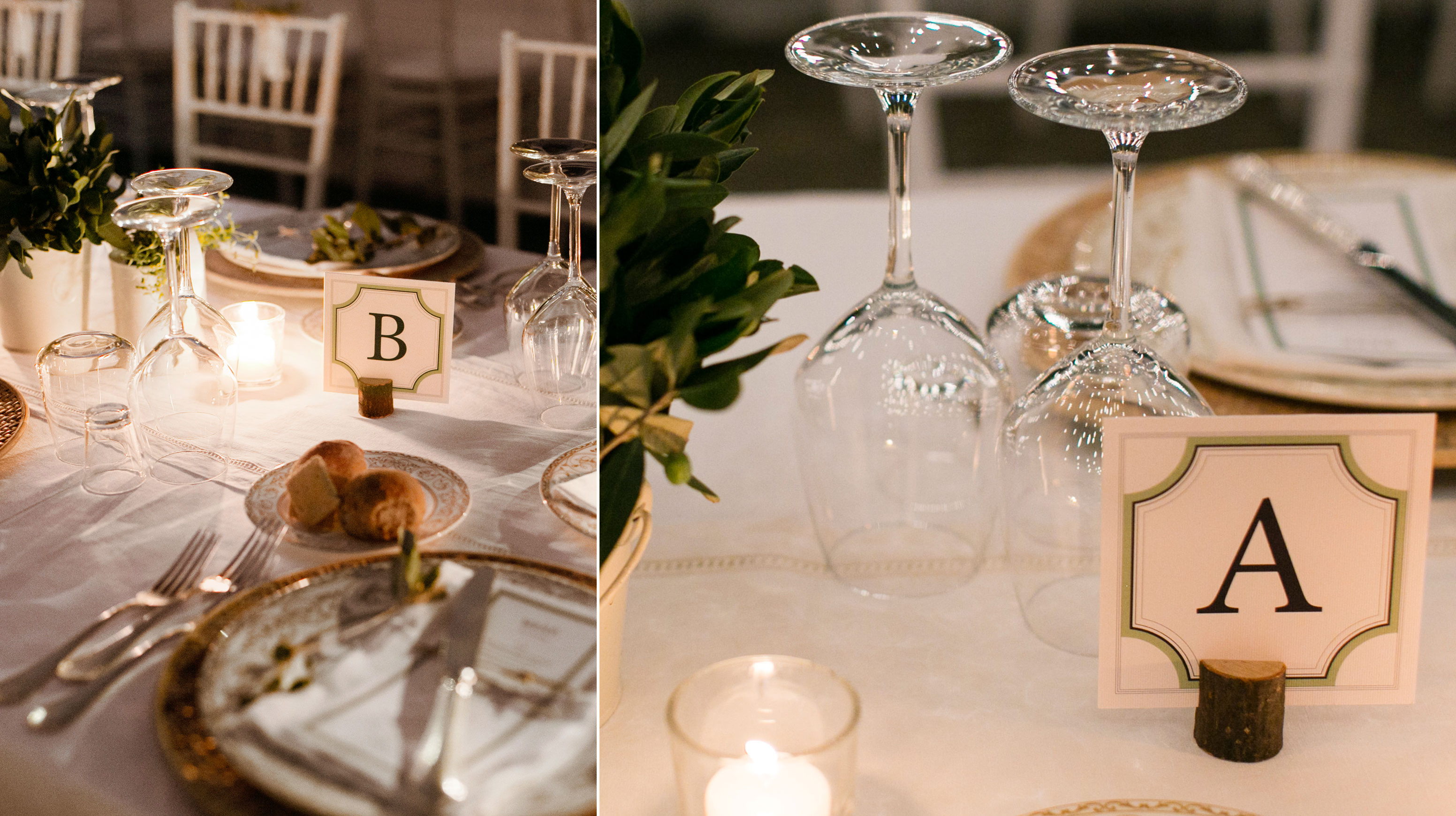
Giorgia Smiraglia
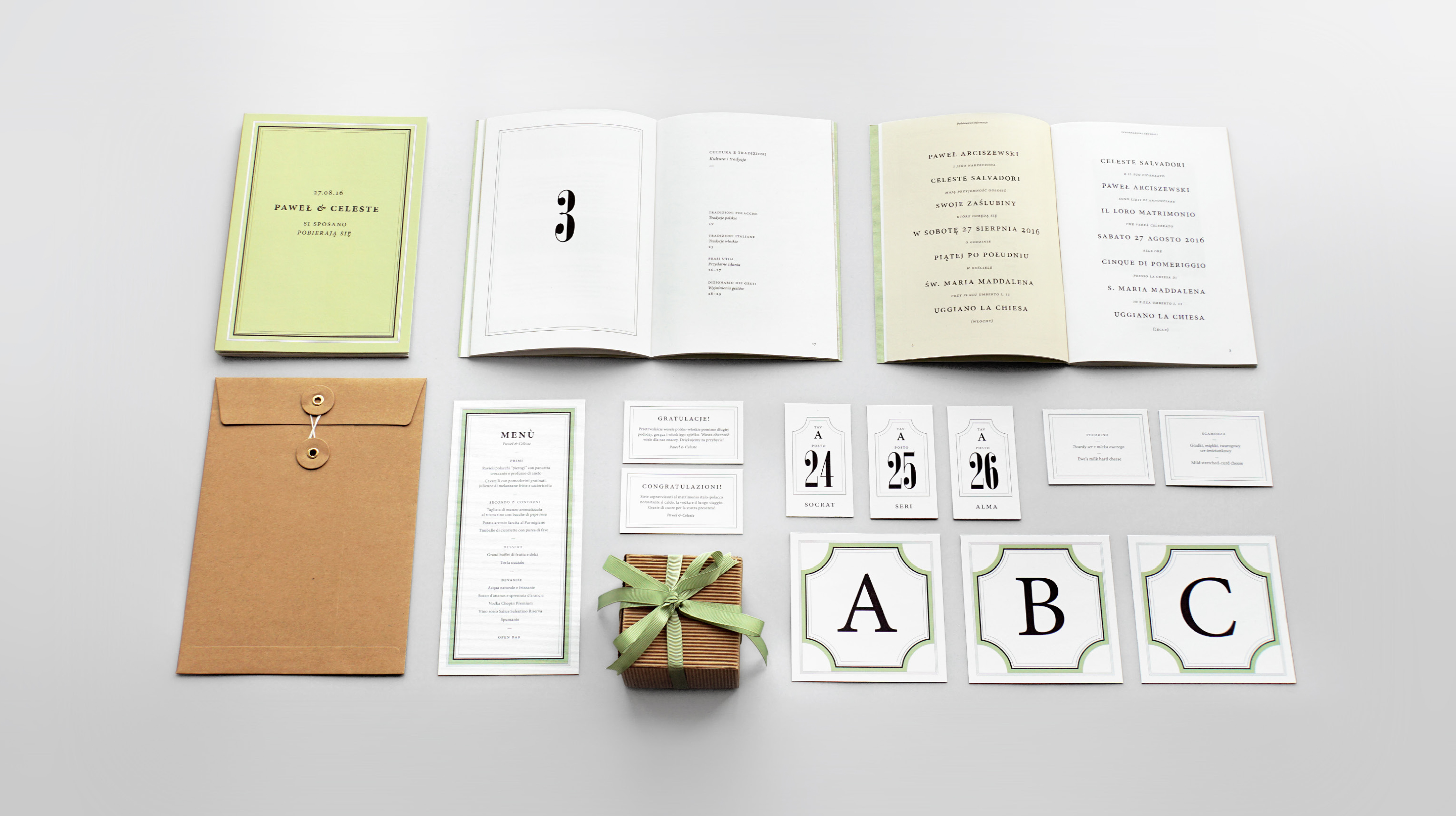
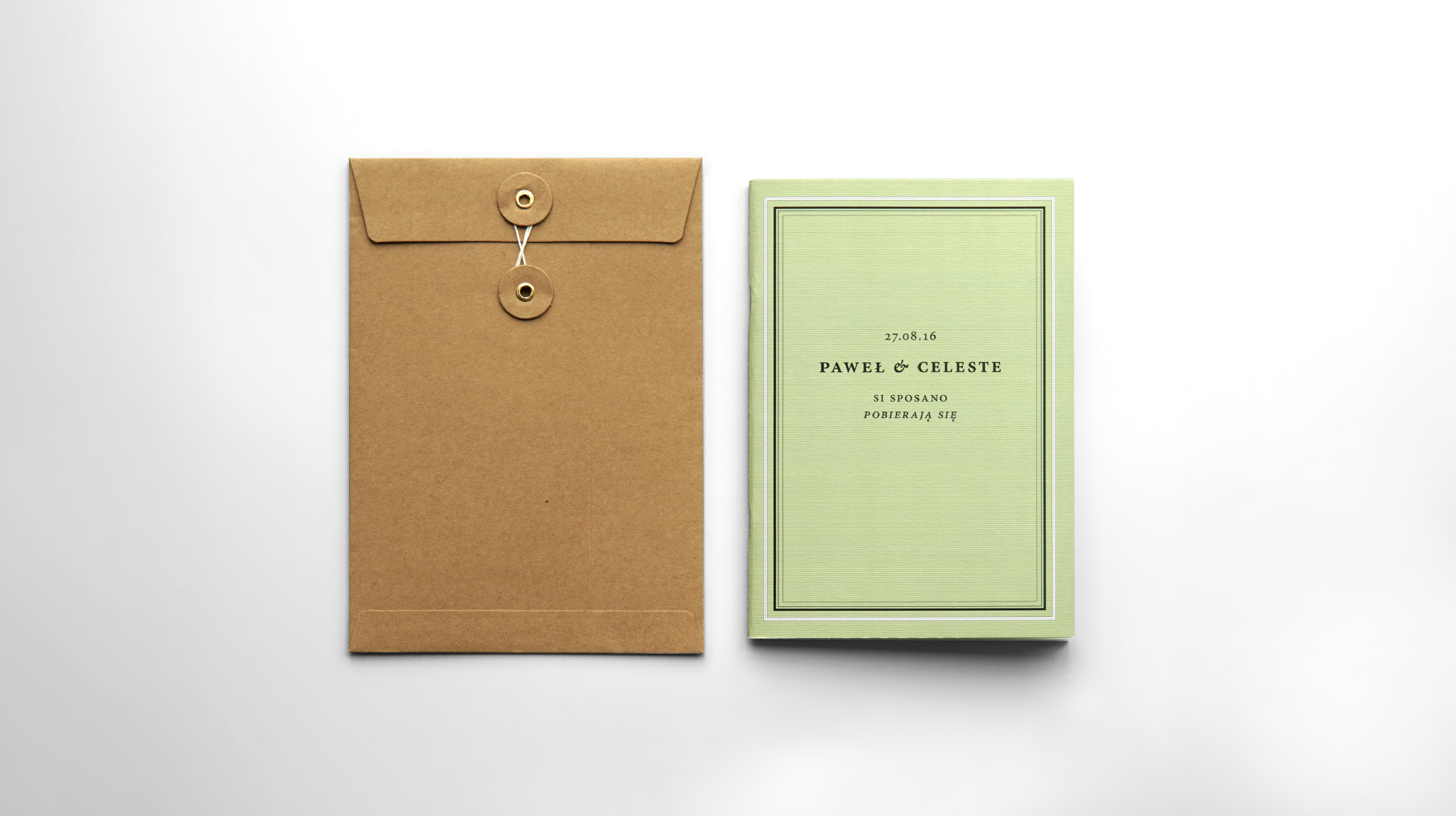
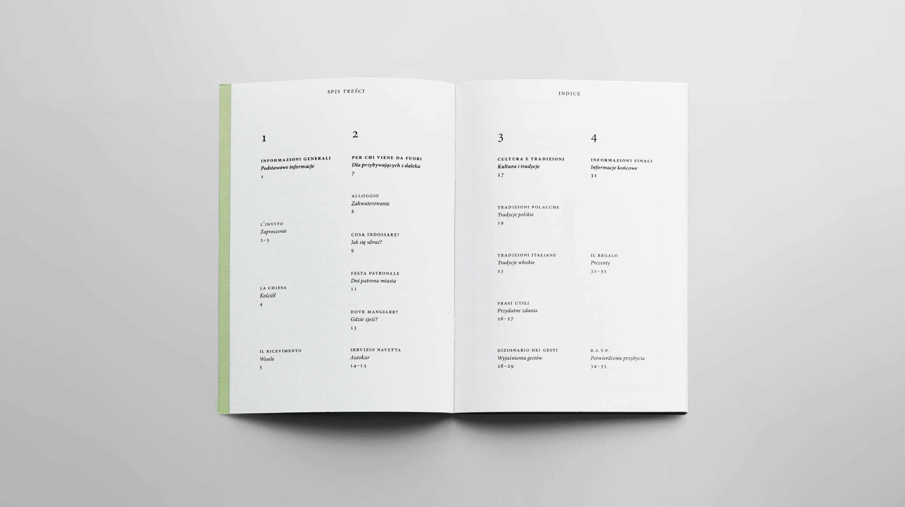
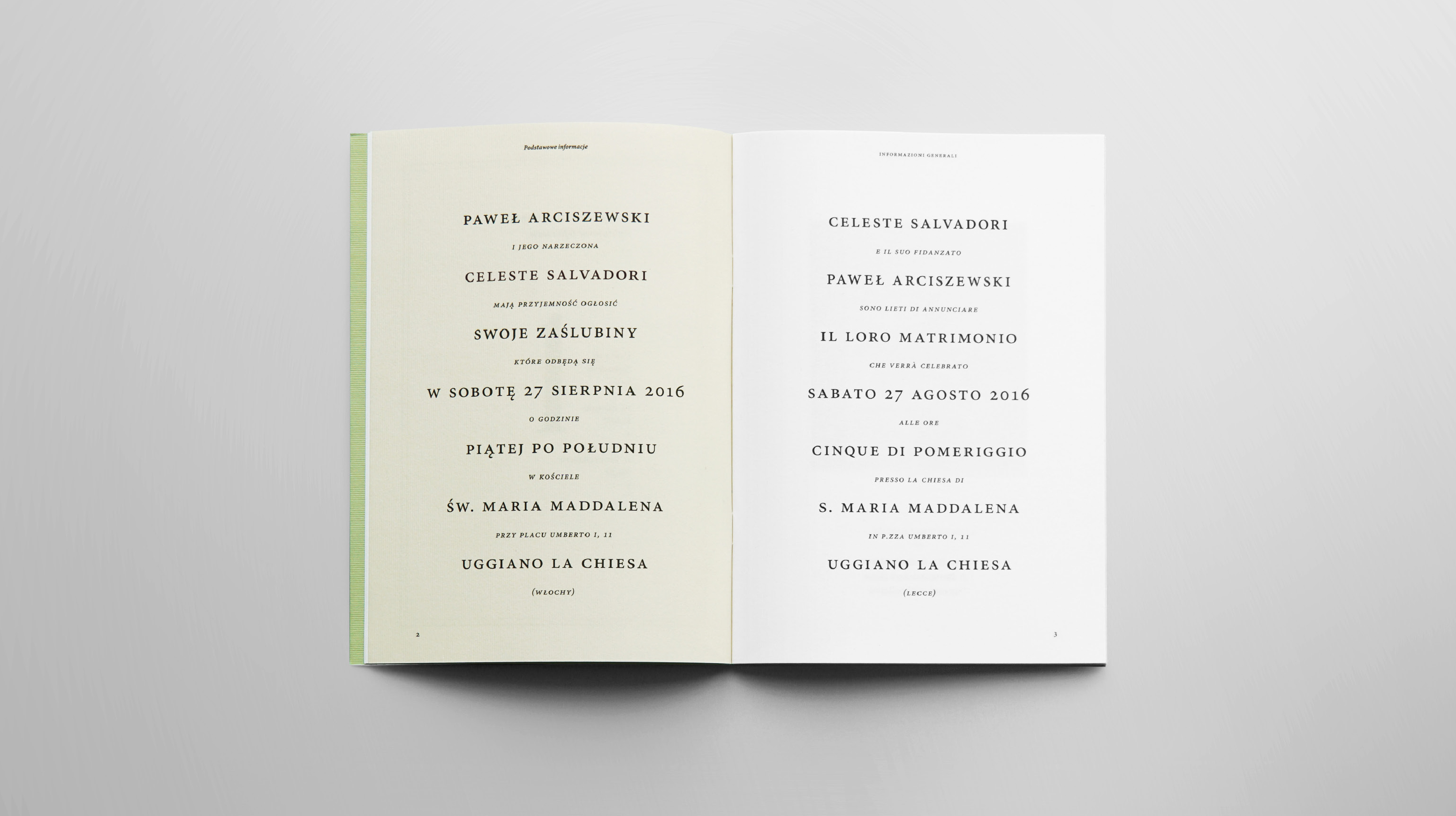
Vino & Wódka
Scotchage
Flair
Basta!
ABOUT
CONTACT
LOGIN
WORK
Ricreazione
Fondazione Achille Castiglioni
Giorgia Smiraglia
Vino & Wódka
Scotchage
Flair
Basta!
ABOUT
CONTACT
LOGIN
Previous
Next